Monday, September 5, 2011

Mixing it Up: Mixing and Matching Pattern to Perfection

All too often, it seems that we are afraid to mix and match pattern in our decorating because we are afraid of making a mistake and having an overall look that resembles a clown's closet.  With that fear, the tendency is to "play it safe", opting for obvious color and pattern choices and sure-fire options such as solid colors so that we can avoid the whole issue.

Another option is to make our fabric choices solely from the mix of coordinating patterns in a particular manufacturer's or designer's collection.  While this latter option is preferable to just choosing matching solids because we don't know what else to do, and while this option can also produce some dynamite results, it still limits our choices.

Of course, you want to use common sense when mixing pattern, because decorating mistakes can be costly.  But experimenting with fabric samples costs nothing (or next to nothing).  Even if you think patterns won't mix, get some samples and try it anyway.  You may be surprised.  Look through some old issues of Traditional Home or any other decorating magazine that features an English decorating sensibility and you'll see a mix of patterns and colors that might surprise (and delight) you.  For example, in the photo to the left, this family room offers a varied but cohesive look with its mix of florals, paisleys and stripes.  It's this type of amalgam that gives a room character, eschewing the too-studied "matchy-matchy" or the all-too-safe use of solids in favor a look that seems to have developed over time.  Experiment and have some fun!


TIPS AND SUGGESTIONS

  • Once you get more confident and comfortable with mixing pattern, you can become more adventurous.  Ultimately, it all comes down to personal preference and what you find pleasing.  Do remember, however, that however you choose to "mix it up", you need to provide the eye not only with a focal point to focus on, but with a place to "rest". This can be as simple as mixing an all-over pattern with a simple, small-scale pattern on an open field. 
  • Mixing pattern adds visual texture, depth and interest.  Take your cues from the arrangement of squares in a patchwork quilt and examine the interplay of pattern and why it all works together (or, in some cases, why it doesn't).  In the photo to the right, the fabric samples from a customer's English cottage style guest room could easily work together in a quilt, harmonizing as they do through similar colors, themes, patterns and fabrics (informal cottons as opposed to formal silks, for example).  In the meantime, the photo to the left shows how these same fabrics and patterns look in the finished room.  Note the dominant pattern of the "feature" needlepoint pillow and how the surrounding, quieter patterns complement the floral design without distracting from it.    Also note how the muted tone-on-tone pattern of the creamy matelasse coverlet allows the eye to "rest" (as mentioned earlier) while still providing interest through use of texture.
  • A general rule about mixing patterns is to use a large scale print with a medium and small print. And don't forget your geometrics! For instance, you can mix a big, bold floral with a small paisley and then add in a nice check or stripe. 
  • If you're really stuck on where to start, pick out a focal fabric or pattern and then take your overall color scheme from this.  For instance, the fabric samples from a master bedroom in the photo to the right show a feature needlepoint  fabric with a background color of pale robin's egg blue and a floral pattern of reds, greens, tans, browns and ecrus.  This fabric is the dominant pattern in the room, and the surrounding fabrics, trims and even rug sample all serve to support the theme of the feature fabric.  To use a movie analogy, you could say that the feature fabric is the "leading lady" and the complementary fabrics the "supporting cast".    Also note that the fabrics here are tied together by their rich and sumptuous fibers, comprising silks, damasks and velvets.  Much like a jewel-toned silk would look out of place in the light and airy "countrified" guest room above, so would a cotton calico look incongruent in this particular mix. 
  • As you can also see in the photo above and to the right, trims are a great way to "tie" fabrics together.  In this case, the rich brown velvet and the red silk damask are tied together through the use of a red and brown rope trim, for instance.   
    • Another useful rule of thumb when mixing pattern is to use colors with the same color temperature (i.e., warms versus cools).  For instance, compare the light, cool tones of the guest room shown earlier with the warm, rich tones of the family room shown in the first photo above.  If you're not sure how to do this, take a cue from fabric manufacturers, who often include in the selvage strip an inventory of the individual colors included in the fabric. These selvage strips can be very helpful with color selection.
    • When mixing patterns, toile is one of those patterns that translates to different media very well.  In fact, the conventional wisdom with toile is that "too much is never enough", meaning you will often see toile wallpaper co-existing with a matching toile window treatment and even a toile fabric on the furniture (bed, wing chair, etc.).  Another common way to complement toile (instead of matching it) is by combining toile with a check pattern in the same colorway (the effect of the clean geometry of the check serving to anchor the toile).  But there are other options that don't have to be boring.  In the example to the left, the window treatments are fashioned from a lovely tone-on-tone green damask that provides texture and an interesting play of light without upstaging or competing with the green toile.  In fact, the pattern in the fabric is almost the "negative" image of the pattern in the wallpaper.  The overall effect is wonderfully harmonious.

    CONCLUSION

    Above all, decorating should be a fun and creative exercise, so why would we want to limit ourselves when there are literally thousands of options out there?  All that's needed to tap into these fantastic reserves of pattern and color is a little self-confidence and a little strategy. 

    Copyright 2011 - All rights reserved - Pamela Yeaton

      Tuesday, February 15, 2011

      Dishing it Out: The Joy of Decorating with Dishes!

      The photo to the right looks almost good enough to eat, doesn't it?  The fruit and sorbet don't look too bad either.  I'll confess: I'm one of those people who believes that the dishware on which our food is placed--whether it's a delicate little work of art or a hearty and bold pop of color--contributes mightily to the overall appearance of the meal.

      I've always been something of a "dishaholic".  I think if I had had my way, my baby dishes would have been pink toile bone china (which would've coordinated nicely with the crystal chandelier I would've had hanging over my crib).  But alas, my mother had other ideas, accustomed as she was to the infant's habit of flinging food and dishes all over the floor in a mixture of defiance and glee.

      As an adult, I still love beautiful dishware.  And, after all, what's not to love?  Whether simple stoneware found at a yard sale or the finest bone china, dishes are functional works of art.  Dinner plates, bowls, pitchers, teacups and platters can all tell a story just as beautifully as can a piece of framed artwork.

      My own feeling is that dishes are way too beautiful to be stacked and hidden away behind cabinet doors when they are not laid out on the dining room table for the occasional dinner party.  It seems we are accustomed to viewing dishes as first and foremost utilitarian items used only for the dinner table, but there is a whole world of decorating options that can and should be explored.  Just because something is "useful" and "functional" does not mean it has to be unimaginative.  Therefore, what follows are some ideas about how to make use of dishware in unexpected but always functional ways (as I am a firm believer that beauty is a function in and of itself). 


      SO MANY PLATES, SO MANY OPTIONS

      Windows and Walls

      To my mind, there are way too many different gorgeous patterns of dishes to not enjoy them on a daily basis in our decor, and what better way to display these little beauties than on the walls?  In the photo to the left, a Johnson Brothers "Old Britain Castles" serving platter in red toile looks stunning against the cranberry red wallpaper in the background.  Meanwhile, the gold Martha Stewart "lion claw" plate holder adds an elegant touch of whimsy to the mix, much like the gold earrings that put the finishing touch on a stylish woman's ensemble.


      As an alternative, dinner plates (or salad plates) also make for a great wall border.  More interesting than the traditional wallpaper border, dinner plates add three-dimensional interest to a room, whether resting on a plate rail at eye level or hanging from decorative plate hangers (or inexpensive plate hooks) near the ceiling. 

      By the same token, dinner plates cleverly arranged on the wall can enhance your window treatments.  For instance, if you have windows where the ceiling height allows it, line decorative plates above the curtain rod.  If your window treatment has no valance (e.g., side panels with a decorative curtain rod), the dishes can act as a visual valance.  If the window treatment does have a fabric valance, the dishes can complement the fabric.  If you have especially high walls, you can even arrange the plates in a "fanlight" or pyramid pattern above the window for added drama. 

       
      "Staging"

      Another idea I like to use sometimes is to "stage the house" with dishes.  We're always hearing about how important staging can be to prospective home buyers, in part because adding things like open books on a side table or cut-up limes on the kitchen island makes the house look more inviting and "lived in".  Why not incorporate at least part of this concept into your own home for your own enjoyment?

      For example, if you have a dining table that is not used every day (say in your formal dining room), consider "setting the table" with beautiful dishes and chargers.  It's not necessary to go the whole nine yards with glassware and silver, but the dishes themselves can add color and detail to an otherwise bare expanse of wood.  In the photo to the above right, I combined this homeowner's striking blue Wedgwood "Madeleine" dishes with a floral centerpiece that features a Spode oversized bowl.  While the patterns don't match exactly, the blues coordinate and enhance each other nicely.  In fact, this leads to another favorite designing habit of mine, which is mixing and matching dishes, whether in a display case or on a tablescape.


      Mixing and Matching

      While matching dishware is beautiful in its own right and can have a powerful visual impact, combining different patterns with common theme or color creates a charming, unstudied beauty that is uniquely yours. For example, in the photo to the left, the homeowner's glass-door china cabinet in her kitchen houses a collection of Spode "Woodland" and flea market china; antique "Depression glass" plates and stemware; and dessert plates purchased from a discount department store.  What makes this mismatched collection work is the coordinating pattern (the wildlife pattern on the Spode, the floral and leaf patterns on the remaining dishes) and especially the coordinating brown, green and pink colors. The effect is furthered by the whimsical "bunny rabbit" place card holders that dot the display.

      Mixing and matching is also a great way to supplement your existing china patterns if you find yourself "short" when expecting a larger crowd than usual.  I sometimes like to place the "matching" china in the side place settings and place coordinating plates at the head and foot of the table (which are often already differentiated with arm chairs).  In the photo to the above right, for instance, this place setting combines Lenox "Mattonella" dinner and salad plates (from the "Mosaico D'Italia" Collection) with a "Woodland" cereal bowl, all resting on a coordinating green leaf charger.  You can really combine these dishes any way you wish.  The matching green chargers for all the place settings further help to make the look cohesive.   

      Aside from being more creative, one of the added benefits of mixing and matching your dishware is the cost savings. While purchasing a service for four, eight, twelve or even more in a matching pattern can get very expensive, you can often find one or two random plates at yard sales or flea markets at a much more reasonable price. Whether in a display cabinet like the one above, on your wall, or set out on your dinner table, give it a try and have some fun.


      ADDITIONAL TIPS AND SUGGESTIONS

      • Plate racks are a great way to display dishes that you don't use for everyday dining.
      • Use a small plate (such as a butter dish or a saucer) as a decorative soap dish for a master bath or guest bathroom to hold bar soaps or a pump soap dispenser.  Also consider using pretty crystal or cut glassware or porcelain (e.g., water glasses or "biscuit" jars) to hold everyday items like toothbrushes, cotton balls and decorative soaps.
      • Use a small plate or rectangular dish as a perfume or cosmetic tray on your vanity.  In a similar vein, a pretty little flea market find like the one in the photo to the above and right makes itself useful as a jewelry tray on a bedside table.

      • Set dishes, soup tureens or bowls on a built-in shelf over a doorway.  In the photo to the left, the homeowner's collection of antique mixing bowls add interest to the space above the French doors leading into her dining room.

      • Use decorative bowls to hold floral arrangements or mounds of colorful fruit.  Or, as an alternative to a large central arrangement on the table, try filling pretty little teacups or coffee mugs with fresh flowers at each place setting (see photo to the right).

      • Pitchers and bowls add a romantic element to today's modern bedrooms.  Once used for practical purposes in the days before indoor plumbing, beauties like the Victorian style seen in the photo below need serve no further purpose than to add old world beauty to modern-day life.


      CONCLUSION

      The purpose of this article has been to provide some ideas for "thinking outside the box" and letting your dishes out of the cabinet for viewing.  Hopefully you've been inspired to come up with some more of your own ideas.

      As a final thought, remember that you are thinking outside the box by decorating with dishware, so don't limit yourself to the "expected" kitchen and dining room options.  Bedrooms, hallways, family rooms, home offices and even bathrooms--any room where you would use any other type of artwork--are all suitable locales to set your imagination free. 


      RESOURCE NOTE:

      It's been mentioned here that you can find interesting pieces at yard sales, flea markets, discount department stores and antique stores.  If you are looking to add to your current collection(s), another good source is the website for Replacements Ltd.

      Replacements Ltd. is a resource for over 300,000 patterns of old and new dinnerware (including china, crystal, stoneware, silver and stainless).  It's a great place to look if you are seeking to supplement your existing collections and is especially helpful if your china patterns have been discontinued by the manufacturer.

      Replacements Ltd. gets their inventory from department stores, estate sales, auctions, manufacturers and individual sellers. However, bear in mind that this website does not allow you to specify that you want "new" versus "pre-owned" inventory.  That said, Replacements Ltd. does "grade" its inventory and charges lesser amounts for inventory with imperfections (which are identified as such on their website).  They also have a 30-day return policy on all purchases.  I myself have used this resource to purchase additional Mikasa wine glasses in a pattern that had been discontinued.  Even if your pattern is still active, though, this website might be worth checking out because you might find better prices than you would elsewhere.
      Copyright 2011 - All rights reserved - Pamela Yeaton

      Monday, October 25, 2010

      Bombay Company Redux: The Return of Reasonably-Priced Elegance

      Bombay Company, once having a pervasive retail presence and then inexplicably (at least, in my mind) going bankrupt in 2007, is re-launching itself as a wholesale provider of the much-loved home furnishings and accessories for which they were well-known.  Let's all heave a huge sigh of relief.

      My own history with Bombay Company is long but uncomplicated, one of decorating fidelity and trust.

      When I moved into my first apartment (it was actually a rented condo), I was short on cash and long on dreams for how I would feather my new nest.  I knew I wanted something rich and traditional, but at the same time budget-friendly.  Enter Bombay Company. 

      Bombay Company was always one of my very favorite places to shop for my new home and to get ideas for putting a signature style together.  They had everything:  furniture, artwork, lamps, knicknacks, you name it.  I loved it all (and I think I bought it all, too).   What wasn't actually purchased at Bombay Company was inspired by them.  I still remember fondly my first Christmas at my new apartment with my then-boyfriend (now husband), a candlelit Christmas Eve with dining table and chairs, Christmas decorations and tablescape all provided courtesy of Bombay Company.  If I had had a fireplace, I think I would have been in my idea of heaven. 

      And it was all affordable.  At that point in my life, I didn't care if something was a real antique or created by a master craftsman as long as it looked good (and did I mention I was short on cash?).  Now, that's not to say that the pieces I bought at Bombay Company were chintzy or cheap (in the pejorative sense).  To the contrary.  As far as I was concerned, Bombay Company was a godsend, effectively allowing people of all levels of income to have a beautifully-appointed home with a decidedly Old World feel.  Ten years after the fact, I still have numerous pieces in my home that came from the land of Bombay and I still love them all.

      In the years since those early days of furnishing an apartment on a shoestring budget, I've moved on to a house in the suburbs with my husband, but I never completely moved away from my love of all things Bombay.  If I was looking for candlesticks or decorative gold mirrors or a reasonably priced desk chair or even baroque Christmas ornaments, their website or their retail store was the first place I'd go looking.  I always knew I'd find something beautiful and affordable.

      That's why I never understood how Bombay Company filed for bankruptcy and closed its retail stores in 2007.  There were literally hundreds of stores doing hundreds of millions of dollars in sales.  It seemed like every decorating diva I knew was a fan.  Nevertheless, the unthinkable did happen and Bombay Company was no more...until now. 

      Recently having launched their new collection on QVC, you can start looking for their new collections in the near-future at high-end department stores and specialty shops, mid-tier home furnishings stores and discount chains.  Rumor has it that their new website will also launch in Spring 2011, allowing the faithful to purchase smaller items direct.  

      Rest assured that I'll be watching for it all, with my credit card at the ready and my memories intact.
      Copyright 2010 - All rights reserved - Pamela Yeaton

      Friday, June 25, 2010

      PDQuick! Taking the Guesswork Out of Hanging Artwork and Choosing Wall Color

      PDQuick Tip:  When hanging artwork, whether it's a single item or a grouping, save your walls from numerous unnecessary nail holes and yourself from unnecessary frustration.  Using wrapping paper, art paper or any other large piece of paper, trace the outlines of the item(s) you wish to hang and cut them out.  If you are hanging a group of art pieces, arrange the cut-out paper pieces on the floor until you are satisfied with the arrangement.  Then, use painter's tape (which won't damage your walls or your paint finish) to hang the grouping on the wall so that you can determine the most suitable height for the arrangement.  Once you've done that, mark the top mid-point of each piece with a pencil and then hang your artwork with confidence.

      As an additional pointer, I'd suggest that when making your paper templates, you don't use newspaper or any other type of paper that could transfer ink or other unwanted color to the wall surface.

      In a similar vein, when selecting paint colors for the walls, I like to create portable "sample boards" that can be moved throughout the room. Most of us will have a general idea of the color family we'd like for our walls, but the real torment comes when trying to select from literally dozens or even hundreds of varying shades from that color family.  Once those choices have been narrowed down to a handful, most people start painting portions of their walls with the sample colors until presented with an ever-more-confusing melange of slightly varying colors.  That's where the sample boards come in, and I've found them to be a lifesaver. 

      When creating sample boards, try to use a good size (at least 18" x 18") piece of sheetrock for your sample, as the closer to the actual wall surface you go with the sample, the closer the paint color will be to the finished product on your wall.  Prime and paint the sample board just as you would the walls (which likely means two coats of paint) and then let dry.  That's it! 

      The beauty of using sample boards is at least threefold:  1) In the (unlikely) event that you change your mind about painting the walls, you won't have to re-paint your sample brushstrokes;  2) the boards are portable, which means you can move them all around the room and observe the impact of daylight and room lighting on the paint color from all angles; and 3) when you've made your final paint selection, you can cut off a smaller piece of the applicable sample board and bring it with you when you go shopping with your "room in a bag" (see my earlier article from April 9, 2010).

      Copyright 2010 - All rights reserved - Pamela Yeaton

      Sunday, June 13, 2010

      Functional Beauty: Unexpected Touches of Elegance

      There's a famous quote by English architect and designer William Morris that goes, "Have nothing in your house that you do not know to be useful, or believe to be beautiful".  This sentiment has long informed my decorating style, as well as the choices and advice I provide to my interior design clients, especially when it comes to decorating the "utilitarian" areas of their living spaces.  In fact, I believe in taking Morris one step further by striving to ensure that nothing useful in the home lacks for beauty. This article will focus on two such oft-neglected areas of the home, the laundry room and the bathroom, and will provide some ideas that will hopefully inspire you to take the next steps in achieving what I like to call "functional beauty".

      When I moved into my first apartment as a single woman, I remember being confronted with ugly utilitarian bi-fold doors that camouflaged the laundry area (it was nothing so grand as a laundry "room").  I was disappointed.  After all, doing laundry is enough of a chore without the uninspiring surroundings.  Still, I learned to live with the functional if unattractive feature for two primary reasons:   1) I knew that as a renter my options were limited; and 2) I knew that my presence in that apartment was temporary.

      However, I had a different mindset when my husband and I moved into our first house.  This time, when I saw
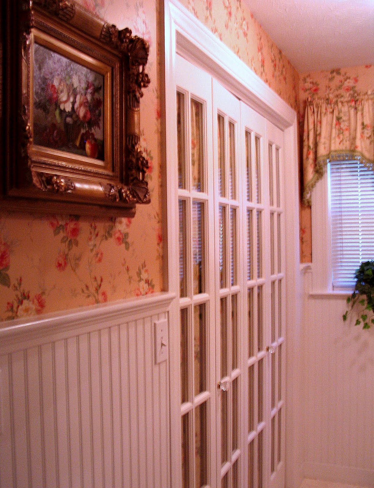
      the same type of ugly modular bi-fold doors closing off the washer and dryer in my new laundry room as had "graced" my former apartment, I knew that I had an opportunity to make that room my own, and that's exactly what I did.  Out came the ugly particle board doors and in their place we installed beautiful French bi-fold doors (see photos to the left and below).  These particular doors came unfinished, but with a new coat of paint, some lovely fabric to line the windows, and elegant crystal doorknobs, they became a functional AND beautiful element to what could have been a dull and dreary workspace.  As you'll note, the fabric lining I chose for the doors matches the window valance and the wallpaper in the room.  This not only gives the room a cohesive designer look, but also ensures that the small room is not crowded by a cacophany of mixed patterns.  In a similar vein, this room has white bead-board wainscoting.  The wainscoting serves the dual purpose of not only protecting the walls against dings from wayward laundry baskets and clothes hangers, but also adds some visual white space that allows the eye a place to "rest" so that the pattern in the room does not become visually overwhelming.

      It's somewhat unusual to find French bi-fold doors in today's decor, but they make a really nice architectural feature and are surprisingly versatile. 
      For example, in addition to their use in a laundry room like this one, consider using a single bi-fold door for a standard size closet, or double doors (as pictured here) for wider closet openings.  Or, if you're feeling creative, French bi-fold doors make a lovely room divider (or even freestanding headboard) as well.  Just hinge a couple of pairs together, paint in a color that complements your existing decor, and line with a fabric you like and you're good to go.  Or, if you prefer to forgo the fabric so as to let in more light (in the case of a room divider), then just paint the frames and mullions, or combine paint with frosted-glass window panes.  There are plenty of do-it-yourself window frosting and etching kits available from which you can choose.

      The laundry room is just one of the utilitarian areas in your home that all too often is either ignored entirely or decorated with a lack of imagination.  Another area is the bathroom.  But as you will now see, that doesn't have to be the case.

      For instance, the bathroom in the picture to the left is very functional but still reflects the elegant taste of the homeowner (as well as her love of long soaks in the tub).  The architectural features of the space, including paneled wainscoting, large windows, marble floors and shower stall, and gas fireplace installed right on the tub deck, all lay the foundation for the luxurious design.

      But what especially sets this bathroom apart are the decoratively functional details that are
      used in unusual ways.  For instance, a gorgeous Oriental area rug in muted tones (as in the picture to the right) serves as an exceptional and interesting alternative to the standard bath mat.  You'd be surprised how rugged these types of rugs actually are, but remember that they are routinely used in foyers as a place where guests wipe their wet and muddy shoes.  If a rug is tough enough to withstand such rough use, it's certainly tough enough for your bathroom floor.

      Likewise, be aware that when it comes to choosing vanities and cabinetry for your bathroom, you are not limited to what is available in the bathroom department of your local home store.  Think outside the box.


      The cabinetry in this bathroom (including the vanity pictured left and the armoire pictured above) is actually "semi-custom", meaning it was assembled from modular parts to my chosen design.  Elements such as raised and recessed panels, fluted pilasters that mirror those of the fireplace mantel, carved rosettes and bun feet give these pieces the look of fine furniture.  Additionally, these particular items were selected from the kitchen cabinetry collection of a local home improvement store, an added benefit of which is that the countertops are higher than is standard with bathroom cabinetry.  This bathroom originally had a built-in closet, but the homeowner elected to remove the closet and go with a storage armoire instead.  The armoire takes up less floor space (and is actually a more efficient use of space) and also serves as a beautiful piece of furniture.

      Finally, the lighting in this bathroom is anything but typical and is a far cry from the "broadway marquee"
      bulbs that often grace the average American bathroom.  The crystal chandelier over the tub, atypical gold-finished sconces attached directly to the oversized mirror, and art lighting are all on dimmer switches, allowing for variations in mood and impact.  Overall, the effect is an elegantly appointed bathroom whose lighting is more typical of that seen in high-end living rooms and bedrooms.

      Other decorative elements that add high style to this bathroom include:

      • Architectural elements and onlays on the fireplace surround;
      • Rich chocolate-brown wall color that contrasts nicely with the ivory of the room's fixtures, architectural panels, and gold frames of the artwork;
      • Silk window treatments;
      • Gold-framed oil paintings (also a nice choice for laundry rooms and kitchens!);
      • Elegant silk drapery panel with tassel tieback on the glass shower enclosure;
      • Candles and candleholders on the fireplace mantel; and
      • Throw pillows on the tub deck.


      ADDITIONAL TIPS AND SUGGESTIONS


      • If you do elect to have a crystal chandelier (or any other light fixture) above your tub, be sure to check local building codes for safety requirements.
      • Silk is tougher than you might think.  The silk window treatments in the bathroom featured above have been in place for about four years now and are still going strong.  I would recommend, however, that if you do choose to use silk in your bathroom that you first be sure that you have adequate ventilation (to prevent damage from excessive moisture) and that the silk is not exposed to excessive direct sunlight (especially late-day sun).
      • Pillows on the tub deck are a great way to soften the otherwise hard surfaces of a bathroom and add a homey touch.  If you're anything like me, you like to take long baths in the winter but not so much in the summer.  If you elect to use pillows around your tub, I'd suggest using them only during the summer months so that they don't get in your way during bath "season".  The pillows featured above are made from a paisley chintz, but there is a wide variety of "outdoor" fabric available these days from manufacturers like Sunbrella that is resistant to moisture and mildew.
      • Even if you have a glass shower enclosure and don't really "need" a shower curtain, consider putting a curtain on the outside of the enclosure to soften the hard lines and angles.  The curtain would be strictly decorative, but don't worry too much about whether or not the fabric is washable.  After all, you would be hanging the curtain on the outside of the stall and so it will be protected from direct contact with water (I'd recommend using curtain rings to hang the curtain from a swing-arm curtain rod attached directly to the wall).
      • If you elect to go with a non-conventional area rug in your bathroom (such as the Oriental style pictured above), just be sure you include a non-skid pad underneath for safety's sake.
      • Kitchens are another area that can be all too cold and uninviting.  Try warming your kitchen up by using select pieces of furniture placed strategically in combination with your more traditional cabinetry.  For instance, a client of mine has an antique maple bureau in her kitchen that houses her table linens and accessories, as well as an old painted armoire that stores her dishes.  The look is inviting and makes the kitchen's decor more in line with that of the rest of the home.
      • If your kitchen is large enough and well-ventilated, consider using an elegant and unusual fabric to cover the chair seats of your dining table.  You will eventually need to re-cover, but this is usually an easy and inexpensive task that you can do yourself.  In the meantime, the unusual and unexpected choice will look rich and scrumptious.
      • I love crystal chandeliers and try to use them wherever possible.  If the ceiling height allows, try using a petite chandelier in your powder room.  Or, you could even hang one over the crib in your baby's room!  (Believe me, she (or he!) will thank you later.)

      CONCLUSION

      I've always been of the mindset that there is no reason why every room in your house can't reflect your personal taste and decorating vision.  Remember that functional doesn't have to mean boring.  Try "thinking outside the box", taking some of the tips I've suggested here and applying them to your own lifestyle.  You'll be amazed what you can do.

      Copyright 2010 - All rights reserved - Pamela Yeaton

      Wednesday, June 2, 2010

      PDQuick! Salvaging Your Sofa

      PDQuick Tip:  Sofas and upholstered chairs can be very expensive to replace or to reupholster.  One way of avoiding such high cost while breathing new life into tired and worn fabric is through the use of slipcovers.  We've all seen the one-size-fits-all types of elasticated slipcovers available in home stores and these can do a good job for the money, but a nice alternative to both these mass-market covers and the expense of reupholstery is to have a custom slipcover made specially for your furniture (or, if you are especially handy with a sewing machine, sewing one yourself).  Not only will such a covering fit your furniture perfectly (and will, in fact, look like upholstery); if your sofa has loose cushions you will also be able to have them slipcovered individually, which is a much neater look and looks less rumpled than the store-bought varieties.


      Additional Tips and Suggestions: 
      • Cutting the fabric for the main body of a slipcover (whether for a sofa or a chair) is an art form in itself, but if you can find someone who knows how to do it well, it is well worth the money.   In the past, I have used an older gentleman who was recommended to me by a nearby fabric wholesaler.  You can probably find your own resource through similar means or through an upholsterer. 
      • In my experience, the cost for labor to have a custom slipcover made has typically been about $150.00 (and you will, of course, need to add in the cost of fabric as well).  Your total cost for a sofa slipcover (depending on the fabric you choose) can be in the range of $300.00 to $500.00.  If your sofa is well-made and has "good bones", you might consider it worth the cost for sprucing up this way and thereby buying yourself several more good years of use. 
      • If you don't want to go to the expense of having a slipcover made for the entire sofa or chair and your furniture has loose seat and/or back cushions, an alternative is to just slipcover the cushions themselves.  This look can be very sophisticated or even shabby chic and is a good idea for a decorating change-of-pace even if your existing cushions are in good shape.  One of the benefits to covering only the cushions (besides the cost savings on the fabric) is that if you have basic sewing skills, you can make simple "box cushion" slipcovers yourself and save additional labor costs.  What makes this an even easier sewing project is the fact that you will already have a cushion (and therefore a pattern) to work with and will be spared the additional effort of cutting a cushion and covering it with batting.
      • If the furniture you are covering is expected to get normal or heavy use, you should be sure to select fabric that is washable.  One of the other great benefits of slipcovers is that when soiled they can be removed and tossed in the washing machine.
      • To avoid future problems with "shrinkage" when you wash your slipcover, bring your fabric to a dry cleaner before cutting to have the fabric washed (and shrunk) and professionally ironed.  This will probably cost you about $70.00 in additional expense, but is well worth it.  A typical sofa with cushions can require about 15-20 yards of fabric, which is way too much fabric to wash in your own machine (and probably too much for the machines at the laundromat as well).  [NOTE:  Once the slipcover is made and the sections of fabric are in smaller pieces, you won't have any problem washing in your home machine.]
      • As an additional point, if you find that the foam cushions on your furniture need replacing as well, consider having new upholstery-grade foam cut.  Again, the cost is not minimal (e.g., a 24" x 80" piece of high-density upholstery foam will cost about $85.00 to $100.00) but it is a small fraction of what a new sofa would cost you.  Just remember that upholstery for use with "heavy-use" furniture should always be high-density.  You should also be sure to cover the foam in dacron wrap, which is rather inexpensive and will "soften" the sharp corners of the foam and make it more comfortable for sitting.  All of these materials are available at any upholstery supply store or in some cases at fabric stores.
      • Even if your sofa is still in good shape, one way to ensure that you protect your investment is to invest in a yearly professional upholstery cleaning.  You can find such services in the Yellow Pages or online.  Just be sure you go with a reputable company (check with the Better Business Bureau or ask friends or neighbors to recommend someone).
      Copyright 2010 - All rights reserved - Pamela Yeaton

      Saturday, May 8, 2010

      PDQuick! Outdoor Rugs

      PDQuick Tip:  To make a big impact for relatively little decorating dollar, consider using outdoor area rugs inside.  Typically made from woven polypropylene, area rugs designed for outdoor use are tough, weather resistant, fade resistant, and easy to clean.  And best of all, they're available in a beautiful and colorful array of designs for a fraction of the cost associated with more traditional indoor rugs.   More and more manufacturers and home furnishings stores are starting to recognize the market for these versatile and inexpensive pieces and are beginning to offer them in more varieties and colors than ever before.  Some of my favorite sources include Grandinroad, Frontgate, Ballard Designs, and Horchow.  You can literally get a striking rug in an 8 x 10 size for as little as $150.00.  Some stores wisely market these rugs as "indoor/outdoor", but all are equally suitable for a deck as well as a family room.
      Copyright 2010 - All rights reserved - Pamela Yeaton

      Sunday, May 2, 2010

      Ceilings: The Sky's the Limit

      The ceiling of the Sistine Chapel in Rome, painted by Michelangelo in the early 16th century, is probably the most recognizable ceiling in the world.  The celebrated ceiling depicts nine scenes from the Book of Genesis, the most famous of which must surely be the “Creation of Adam”.  Far more than mere decoration, the symbolic and metaphorical significance of the ceiling's elaborate design is the subject of numerous scholarly texts.

      Even some of the more notable buildings in Washington, D.C., the seat of democracy, include ceilings rich with symbolism.  The U.S. Capitol building, in particular, is replete with densely decorated frescoes and vistas in the ceilings of its hallowed halls.  The ceiling in the eye of the Rotunda itself contains the classically inspired mural Apotheosis of Washington, depicting the ascension of George Washington into heaven, while the first floor corridors of the House and Senate wings sport ceiling designs full of intricate scenes from significant periods, historical figures, and events in American history.

      Especially ornate are the so-called Brumidi Corridors in the Senate wing.  Signs of the zodiac (of all things) detail the ceiling at the north end of the corridor, while “lunettes” over the corridor's doorways symbolize the

      business that was conducted in the various committee rooms at the time the murals were painted.  For instance, in the photo to the right, the Roman Goddess of War adorns the entrance to what once was the meeting place of the Military Affairs Committee.

      When you look at these striking works of art, it makes you wonder why it is that the typical homeowner's ceiling remains the “final frontier” of decorating, a frontier that is usually ignored.  Most of the time, our ceilings give us no reason to look up, typically painted a plain white and completely devoid of drama or even interest.  But your home doesn't have to be a historical shrine, cathedral or palace to be worthy of stunning ceilings, and I'm here to hopefully provide some inspirational looks and ideas as well as some suggestions for how to achieve them.

      COFFERED CEILINGS 


      One of the most popular architectural styles is the coffered ceiling, which is characterized by a grid-work of beams or moldings that are used to create sunken panels in the shape of a square or rectangle, or even octagon shapes of various sizes.  The depth of the beams and moldings is what determines the depth of the coffers themselves and their sizes will vary accordingly.  Once the grid has been installed, the choices for how you want to “fill the boxes” are endless.   

      For example, the coffered ceiling in the photo to the left is from The Hermitage Museum in St. Petersburg, Russia.  The “St. George Hall” (also known as the “Large Throne Room”) is a sumptuous example of the unmatched opulence of Russia's imperial past, and its ceiling has large, deep coffers and gilt bronze decorations in a baroque design that mirrors that of the hall's floor. 

      But even if you don't live in a palace, you can feel like you do by creating your own simpler version of this ceiling.For instance, the bronze decorations in the Hermitage ceiling can be recreated by using gold leaf or gold leaf paint with reddish undertones to stencil the design within each box of the grid (and to create the Greek key pattern on the “coffers”); or, for a more “3D” effect, by using gilded architectural onlays that you finish yourself.  While it may prove challenging to find such onlays of sufficient size for this project (not to mention expensive), try using a combination of several smaller onlays arranged together to create a larger center medallion and then using single smaller appliques in the corners of your coffers and around the edges.

      Obviously, deep coffers are not a good idea if you don't have a very high ceiling (since they will effectively lower your ceiling height), but you can use smaller crown moldings or picture moldings to create your sunken panels for the look of a coffered ceiling “grid” without taking up visual space in the room.  This is also a good option for vaulted or cathedral ceilings where the ceiling is not flat or otherwise conducive to deep coffers.  It's also a good recipe for a stunning design.

      As you can see from the photo to the left, the ornate molded ceiling from London's Goldsmiths' Hall obviously doesn't suffer from a lack of height, but it's drama derives not from deep coffers but from the highly-detailed intricacies of the grid design.  At first glance, the thought of trying to replicate such a design might seem daunting.  However, if you consider the design as a series of repeated elements instead of one massive work of art, it becomes definitely do-able! 

      As you can see from the close-up view (see above right), those repeated elements are almost like multi-framed “pictures” separated by a grid comprising gold-leaf stenciling and multiple rows and columns of small rosettes.  Once you consider the project from this point of view, the means to re-creating such a look on your own ceiling becomes clear:  Picture frame moldings, stencils and simple architectural moldings, along with a whole lot of patience, are all you need. 

      Also important to note in this design are the rich tones of the background colors.  If you were to use less

      saturated tones (such as pale greens and aquas) with a silver leaf instead of gold, the effect would be lighter and subtler, perhaps more akin to the mood created by the ceiling to the right.  

      Having a similar grid pattern as that found in Goldsmiths' Hall, this ceiling from the presbytery at St. David's Cathedral in Wales evokes a very different mood, due primarily to the color scheme and the almost primitive decorative pattern.  In fact, the overall design is more reminiscent of Pennsylvania Dutch than what we might ordinarily associate with a European cathedral.  For this design, it's appropriate that the background color is a pale yellow because it shows the vivid colors of the designs to their best advantage.    Replicating the design of this ceiling in your own home is as easy as using a combination of simple moldings, a lot of colorful paint, and a repeated stencil pattern.

      OTHER CEILING OPTIONS

       
      While coffered ceilings are a popular and traditional choice, there are many other options from which to choose, some of which will now be addressed.

      Paintings and Murals

       
      It's commonplace to decorate our walls with artwork and murals, but how often do we do the same for our ceilings?  The painting in the photo to the left, which is displayed in the ceiling above the staircase at
      Chatsworth House in Derbyshire, shows the dramatic impact such a mural can have. Granted, a large scale mural is not suitable for every room (or every budget).  You need to have a large room with a high ceiling or a very open staircase (such as a two-story foyer) in order to afford the viewing eye the necessary perspective.  

      But if you do have the suitable architecture for such a look, there are ways to achieve it at a fraction of the cost.  While most of us don't have the artistic skills to paint a mural and don't have the means to commission a masterpiece, there are wallpaper murals available at all price points.  After framing the mural with picture molding, you can give it more depth and make it look more authentic by giving it a crackle finish and even antiquing it with a burnt umber glaze for a more “old-world” look. 

      If you decide to actually paint something yourself, a sponged-on “clouds and sky” look is fairly easy to achieve, as are more primitive subject matter and geometric patterns.  For example, a really
      interesting and handsome choice would be to paint a compass rose.  Especially nice surrounding a chandelier or other pendant light fixture, there are patterns and pictures of compass roses available online and they are fairly easy geometric designs to re-create. 

      Or, if you have the budget for it, you can also look into finding a local artist who will do the project for you (perhaps something trompe l'oeil). 


      Moldings and Stencils and Tin:  Oh My


      The visually stunning ceiling in the picture to the right is from the 14th century St. Mary's Basilica in Krakow, Poland.  The entire church is eye-popping, but the vibrant blue
      groined spaces of the ceiling, with their fields of gold stars and stone ribs decorated with more vibrant colors of gold and red are especially arresting.  Imagine gazing up at a view like this every night before going to sleep and waking up to its beauty every morning.

      If I were to attempt to re-create this design, I would probably make one large center rectangular space in the ceiling that was outlined with picture molding painted with a gold paint or leaf that has reddish undertones.  I would then create the “ribs” and groin spaces by doing an “X” pattern with more picture molding bisecting across the center of the rectangle and a rosette onlay placed in the center of the “X”, again painted or leafed with the same finish as the frame of the design.  Once you have this basic structure in place, the rest would be easy:  Vibrant blue paint and a gold leaf stencil or freestyle field of stars and you've got yourself a truly celestial ceiling.
       

      Another rather simple but effective technique is to use the combination of appliques and color to
      highlight your ceiling.  In the picture to the left, which is a view of the bottom of a chandelier hanging from the ceiling of the Central Club in London, a delicate blue background color and contrasting white pattern of bellflower onlays and other architectural decorations creates a look reminiscent of Wedgwood china.  Another option would be to use a decorative ceiling medallion around your ceiling's light fixture and then to complement the medallion with moldings around the borders of the ceiling and similarly styled corner ornaments.  Manufacturers such as Decorative Millwork Products, Enkeboll and Decorators Supply all carry these types of details that are designed specifically for ceilings and they also offer suggestions for how to configure them into a suitable design.

      Finally, tin ceilings are another style that can add great texture and interest to a space (see photo to the

      right).  Tin ceilings are often associated with farmhouses or Victorian style homes, but they can make an elegant or rustic addition to almost any style of décor.  The drama of the ceiling in the photo is created by the play of light on the burnished gold tones of the metal and the intricately embossed pattern.  Tin ceiling designs are available in very simple and very ornate styles, and your options are further expanded by the ability to paint the tin in any color you wish.  One “shabby chic” look is to paint the tins and then lightly sand so that the original metallic finish of raised areas of the tins' embossed design is exposed.  Or, for a more formal look, you could do the opposite and paint the entire tin ceiling and then highlight the raised portions of the design with gold paint.  It's painstaking work, but well worth the effort. 


      CONCLUSION

      Whether it's the intricate detailing of a coffered ceiling; the delicate tracery created with architectural onlays; or the vibrant combination of rich paint color and contrasting stenciling, there are many creative ideas for your ceiling from which to choose.  Inspiration is all around you; all you need do is look. 


      ADDITIONAL TIPS AND SUGGESTIONS:
       

      Coffered Ceilings:

      • If your ceilings are painted a stark white, one thing I would advise with a coffered ceiling is that you choose another background color for the inside area of your grid “boxes”.  Both the moldings that make up the grids and the decorations within will be highlighted to better effect than with a white background.  While almost any color would be preferable to white for just this reason, the bolder the better.  This is your opportunity to really make a statement, so pick a color that will really pop.
      • Other options to consider for coffered ceilings include using wallpaper with an interesting pattern to line the “bottom” of your coffers or, if you're feeling really bold, using mirror or mirrored tile.  Just be sure that before attempting to affix any type of mirror or other glass (or glass tile) to a ceiling you  research thoroughly the safest and best methods for doing so to ensure that the mirror or tile stays in place.  One place you can find directions for doing so is on the Service Magic website, but there are many information sources available on the subject.
      • Use plywood panels that have been upholstered with dacron batting and a beautiful fabric for a particularly plush look.  You can even add further detailing by attaching upholstery nail strips around the edges of the panel, or you can “tuft” the panels with fabric-covered buttons.
      • If you don't want to coffer the entire ceiling, consider creating just a central square or rectangle coffer in the middle of the ceiling (and surrounding the room's ceiling fixture, assuming it has one).  If you opt to do so, you will probably want to use a picture molding for the actual edges, as a deep crown molding would look odd.  Consider painting the inside of your single panel a rich, bold color to really make it stand out and then adding detail such as gold or silver leaf stencils, architectural onlays, or any of the ideas already mentioned here for coffered ceilings. 

      More Ideas and General Suggestions:

      • If you're not ready for the more elaborate designs suggested here, you can always just paint your ceiling a bold color (or any color, for that matter!).  I'd recommend you use a premium wall paint (and not a ceiling paint), because the quality of the paint will be superior and the color truer.
      • For a small room (like a powder room), make an elegant statement by gold leafing the entire ceiling; using mirrored tile on the entire ceiling; or even wallpapering the ceiling in the same pattern as the walls.  Because the room is very small and not used for long periods of time, this is your opportunity to really experiment and try something different.
      • Use mosaic tile (glass tile is especially lovely) to create a pattern of your own design.  Mount the mosaic tiles on a piece of plywood backing and then attach the whole thing to the ceiling, with attached picture frame molding on top of the edges of the plywood to “anchor” the plywood in place. 
      •  If you are like most homeowners, your ceilings have some amount of texture to them.  Depending on the amount of texture involved, such ceilings can present some challenges depending on the decorative treatment you want to apply.  For instance, it may prove difficult to get architectural onlays and appliques to lay flat against the surface.  If this is the challenge you are facing, you have a couple of options.  One option is to smooth the textured surface (and websites such as diyadvice.com and Sherwin-Williams will tell you how).  Or, if you are only working with a small section of ceiling, attach your tiles, mirror or other applied decorations to a piece of plywood that is then attached directly to the ceiling and then further anchored by a picture frame molding.  The plywood, for all intents and purposes, then becomes your  (smooth) ceiling and you can paint and decorate accordingly.


      Photo credits:


      Ceiling from Brumidi Corridors, U.S. Capitol Building, Washington, D.C.  Photo courtesy of the U.S. Architect of the Capitol (or "AOC") website.

      Ceiling from St. George Hall at The Hermitage Museum, St. Petersburg, Russia. 
      Photo used by permission and license of dorena-wm.

      Ceiling from The Livery Hall of Goldsmiths' Hall, London, England.   Photo used by permission and license of ianvisits.

      Close-up view of ceiling from The Livery Hall of Goldsmiths' Hall, London, England.   Photo used by permission and license of Martin Deutsch.

      Ceiling from the Presbytery of St. David's Cathedral, Wales.  Photo used by permission and license of Diva Sian.

      Ceiling above the oak staircase at Chatsworth House, Derbyshire, England.  Photo used by permission and license of Elfleda. 

      Ceiling of St. Mary's Basilica, Krakow, Poland.  Photo used by permission and license of Lochinvar1.

      Ceiling of the Central Club, London, England.  Photo used by permission and license of MindSpigot.

      Tin ceiling.  Photo used by permission and license of SurprisePally. 
      Copyright 2010 - All rights reserved - Pamela Yeaton
       

      Friday, April 23, 2010

      Details, Details, Details

      I once had a client who bought a very expensive lamp simply because she liked the finial.  Granted, the finial was a very beautiful and intricately carved jade bauble, but nothing that couldn't have been purchased separately and retro-fitted onto a less expensive lamp (or one that she already had in her home).  I suppose that she understands that now, but her story is a perfect example of just how important details like lamp finials can be to a room's overall design.

      I myself have always been a stickler for details when it comes to decorating.  Details add personality, depth and texture to a room, enhancing your décor when used properly.  However, you need to walk a fine line with them: Used inappropriately, they'll overwhelm and be a distraction.   I often compare this delicate balance to accessorizing an outfit:  Too little and the outfit looks unfinished; too much and the outfit is a busy mess.

      There is an infinite variety of detailing that you can use to add spark to your décor.  Finials, fan pulls, tassels and trims, decorative buttons, cabinet knobs, cord covers and drapery hardware are just a few of the options.  While this article focuses on only a small percentage of these, you owe it to yourself to have some fun exploring the many details of distinctive design.


      DOOR KNOBS AND CABINET PULLS

      Some of my favorite details for adding interest and expressing personality are door knobs, cabinet pulls and drawer pulls.  This is a great way to update and spruce up old cabinets or a tired piece of furniture without spending a lot of money.  I personally love crystal doorknobs like the one in the picture to the right and use them wherever possible to add a touch of sparkle to otherwise plain doors.

      Much like lamp finials, doorknobs and cabinet knobs/pulls of all styles are readily available online and range from traditional to whimsical (in shapes like fish, eating utensils (as for kitchen cabinets and drawers) and flowers).  You can use such hardware to complement your furniture style with classic Queen Anne, Chippendale or Hepplewhite detailing, or you can use knobs that deliberately contrast with your furniture to make a bold statement.

      One chic look that I especially like is using crystal drawer knobs on an old bureau or table that's been painted and then sanded or given a crackle finish.  The contrast between the weather-worn finish of the furniture and the elegant sparkle of the crystal is unexpected and enchanting.  I also like to use colored knobs for a more whimsical look.  In the photo to the left, the blue glass “melon” knob adds a bright pop of color against the white surface of these French bi-fold closet doors in a client's home office.  The deep blue also picks up the blue in the country French fabric lining the door.


      TASSELS AND TRIMS

      Another fun and effective way to add detail to a room is with tassels and trims of all sorts (also known as “passementerie”), and the options are almost limitless.

      For instance, rope trims offer a nice alternative to welting on pillows, box cushions and table skirts and add color and texture.   Gimp (or flat trim) is a great option for use with window treatments and bedding.  In fact, I like to use gimp for areas that get a lot of incidental contact because these types of trims aren't prone to unraveling (unlike a tassel trim, for example).  Gimp is also good for use as a border for drapery panels (and requires less sewing skill than does using a contrasting fabric border).

      For an especially elegant look, try a breaded trim.  In the table runner in the photo to the right, the woven trim and the jewel-like beads complement both the color and period look of the antique toile fabric.  When I designed this runner (and its coordinating table topper), I fancied it a detail that would've been right at home adorning the boudoir of Catherine the Great (or some other decorating diva!).
      Besides looking great, trims can also serve functional purposes as well. For instance, the tassel trim featured on the ottoman to the left is not only timeless in its appeal; it also effectively covers the ottoman's horizontal seams.  One of the additional things I like about this trim is the way it mirrors all of the vibrant colors of the ottoman's fabric without competing with or overwhelming it.  Because the fabric is and should be the focal point of this piece, the trim's effect is subtle, serving to add depth and texture to the piece. 


       Tassels can be simple and monochromatic or elaborate, multi-colored works of art (and they are priced accordingly).  In addition to the traditional “key tassel” like that pictured to the right, one of these more elaborate “statement” tassels can be used as a drapery tieback.
      For a special touch, try using chair ties and tassels on the arm chairs of your dining room set.  In the photo to the left, I especially like the way this chair tie plays off the chair's seat fabric and enhances the whole look.  This homeowner was so enamored with the look that she initially wanted to put similar ties on all of her dining chairs.  Ultimately, though, she agreed that the ties were more effective when used only on the table's arm chairs because they further set these more elaborate chairs apart from the simpler side chairs.  In decorating, as in other areas of life, it's important that you know when to say when.

      Generally, the selection of trims that you will find in stock at the fabric store represents a very small percentage of the choices available through custom order.  If you have the time and patience, it's well worth the effort to pore through some of these custom choices (or have your decorator do it for you!).  Many are only available “to the trade”, but it's relatively easy to find a dealer through whom you can purchase such trims.  There are some great online sources where you can get more information about the many trim and tassel styles available.  Check out the “Resource Guide” below for a few of these sources.


      CONCLUSION

      Details can be one of the most fun and rewarding aspects of decorating a room.  Whether you apply these details to a completely custom design or to a mass-produced store-bought window treatment, any door, cabinet, dining chair, light fixture, drapery or upholstered furniture piece is an opportunity for embellishment that reflects your special style stamp.   Give it a try.


      ADDITIONAL TIPS AND SUGGESTIONS:

      • Use cord covers on hanging light fixtures to hide the fixture's electrical cord and chain and to add some subtle drama (as with a cord cover in a sassy cheetah print).  If you elect to purchase the cord cover (as opposed to sewing one yourself), just be sure to buy the type with an open vertical seam that closes with Velcro, allowing you to put the sleeve on without having to remove the chandelier from the ceiling.
      • Where possible, install “rim locks” on your interior or screen doors.  Rim locks are locks and plates that are fixed to a door's surface instead of being mortised inside the door and they can be quite elegant for a traditional home, providing some historic detailing.  However, rim locks are not really designed for or adequate as a security lock.  Therefore, they should only be used for interior doors or for decoration on an exterior door where there is another device for security purposes (such as a deadbolt).
      • If you have bought pre-made pillows from the store that could use some pop or if you have plain matching pillows that came with your sofa, try hand-sewing or even hot-gluing on tassel trim or gimp for some added personality.
      • If you have a store-bought throw or bedspread, sew some bullion fringe around the edges for a more luxurious look.  Bullion fringe is also a great choice for trimming the kick-pleats on a sofa or for detailing an upholstered ottoman.
      • Use “key” tassels on china cabinet doors or decorative boxes.
      • Purchase inexpensive carved wood cabinet knobs and gold leaf or silver leaf them with liquid leaf.  The look will be richer and more textured than knobs with a plain metal finish.
      • Note that if you use a rope trim with a “lip” attached to it, it will be easier to sew between your seams with a sewing machine (as opposed to a rope trim without a lip, which needs to be hand-sewn on top of the fabric).
      • Use decorative buttons (store-bought or custom fabric-covered) to add detail to window treatments, to closures on duvet covers, and to tufted ottomans, pillows and cushions.
      • Use pleated trim to add nice depth and texture to the edges of duvet covers, coverlets and pillow shams.
      • Fluted drapery rods with intricately carved finials like that pictured to the left and fabric rosettes

        like that attached to the valance to the below right will add designer detail to a window treatment, taking it to the next level.  You spend a lot of time and money designing your window treatments and bringing them to life with carefully-chosen fabrics.  Add some details like these and your investment will be apparent (and well worth it).


      RESOURCE GUIDE:

      Knobs and pulls:

      myknobs.com
      coolknobsandpulls.com
      Emtek (doorknobs)
      Amazon
      Anthropologie (great source for quirky, unusual cabinet knobs and drawer pulls).


      Fan Pulls:
      lampfinials.com


      Cord covers:
      Ballard Designs
      Shades of Light


      Lamp Finials:
      Pronto.com
      Lamps USA
      lampfinials.com
      Tassels & Trims (stunning selection)


      Trims:
      Decorative Fabrics Direct 
      Tassels & Trims (to the trade only)
      Interiormall.com
      Kravet  (to the trade:  doesn't sell to the consumer directly)
      The Curtain Rod Shop (drapery hardware, finials, trims, tiebacks)


      Rim Locks:
      Baldwin Brass Hardware
      House of Antique Hardware
      Historic Home Hardware
      Copyright 2010 - All rights reserved - Pamela Yeaton